Tuesday, August 30, 2011

Quicky Page

Good Evening,

I thought I would post a super quick page that I did in probably under 10 minutes. I love how sometimes you just have things that are pre-done and look great together. This page is of my gorgeous little cousin Lyra, she is 4. At my sister's wedding last month she told me she was going to catch the boquet, and she did. The man who caught the garter was so sweet, kneeling down to dance with her (she had been the center of the dancefloor all night) but she got shy and just rocked a little and chewed on her gum. I can't seem to get the fingerprints off the picture to save my life. That is what happens when you don't quadruple check a picture order, you end up with glossy instead of matte photos.


The papers, title, journalling square and stickers are from My Mind's Eye "Little Miss Muffet" Collection. The flowers are from Prima Marketing and the ribbon and pink cardstock are from Close to my Heart. I put a few stickles around the title as a highlight and BAM, there is a page done. Note how the flowers are placed so that your eye is drawn from the title, to the picture to the journalling. That is the visual triangle that I mentioned last night!


Bella Blvd Design Team Submissions


Hello and Happy Day to everyone,


Today I am going to share with you my submissions that I made to the Scrapbooking Layout Bella Artista Team Call for Bella Blvd. I am not as confident with these submissions as with my Viva Las Vega Stamps ones, for the simple reason that I only had a limited amount of product in stock and my local scrap store didn't have anything to offer. I am not sure if I met the required 80% of their product or not, but either way I have 4 layouts to share that I like.


The first one is my dearest boy, and his new coat, it is one of the ones that the sleeves zip off of. I used some of the paper from the Mr. Boy line and cut out shapes. I also had some chipboard accents that I threw on there. I did a little bit of distressing around the edges to give it a rugged look.


This layout is of my mother's retirement dinner. My aim was to make the circles look like balloons with a big bow at the bottom. The pink scallop was done using a Martha Stewart punch and I covered the messy corners with some pretty striped paper from Bella Blvd. The black rectangle is also from Bella and says "There is no surprise more magical than the suprise of being loved". There were so many people out that night to support Mom after her 30 some odd years of teaching, that we filled the entire restaurant and had only booked half! The bow at the bottom was made by taking quarter inch strips of paper and bending it and gluing the edges at the center, I did this with 2 different lengths and placed them on top of each other. To cover the messy center I used a chipboard flower.


For this page I kept things very simple. I used the new Art Philosophy Crickut collection from Close to My Heart to cut out the circle border and the flowers. I inked the outside of the flowers to make them stand out from each other, then put a glittery brad in the center of 2, and a chipboard flower in the center of the 3rd. The border on the left is made by using 2inch Sookwang tape covered using copper glitter ritz. I then attached the border on top. The rectangular strip is Bella and says "These are the things we do together". The pictures are of my cousin, his wife and baby and some of my other cousins playing on Coffin's Point outside our cottage in PEI.


This final layout is of my beautiful "niece" (best friend's child). I took a white piece of cardstock and masked it off, then spritzed it with Glimmer Mist. I cut out two partial circles of Bella papers and put them behind a Close to my Heard chipboard circle. Along the bottom edge of the pictures I took two strips of Bella paper and did a double accordian fold so that it would lay flat but have some dimension. The journalling block is also from Bella and there are 3 chipboard accents added on (yeah for visual triangles!!)


I hope that you guys, and Bella Blvd like these layouts! See you soon.

Monday, August 22, 2011

Viva Las Vegastamps DT Call



I am really excited about this dt call. I love Viva Las Vegastamps and actually would like to visit Las Vegas not because of the gambling (which I don't do) or the drinking (which I don't partake in) but because this store looks amazing!! I literally own 3 pounds of their stamps!! There is a picture of them covering our chest freezer from a while back. For this call I picked 2 of the stamps that I use the most and made cards out of them. I couldn't narrow it down, but if I had to pick one to submit, it would be number 2.


Ok so card number one is this beautiful little dress on a hanger. I thought it only fitting that VLVS be warned about my love for glitter, so I used my spellbinders and cut out a little background of sookwang tape on cardstock and covered it with a purple Glitter Ritz. The patterned paper is from Close to my Heart's Sweetheart package, with the lace and flower ribbon coming from their pink package.


The white flowers are from Prima Marketing, and the flat white flower is from CTMH as well. The pin is from Making Memories.


As goes on the back of most of my cards, another fabulous VLVS!!


Card number two is a twisted easel card that uses a lovely 20's flapper lady. It looks way harder than it actually is to make. Cut your cardstock and make your normal center fold, then just score a diagonal that makes you happy on the front (I used 45 degrees, so corner to corner). This will be your twisty fold. You then make a shape that makes you smile on the front, I used one from the new Close to my Heart Cricuit cartridge in 5 and 4.5 inches, but there are many dies available for that particular shape. It is important that you decorate the inside of the card nicely as well, since it is ment to sit open. It is also a good idea to put something to tuck the front fold behind, it makes the card more stable. This is what the white rosette if for. I undercut the corners on a square of patterned CTMH paper and tied some ribbon around. I didn't put in a sentiment as this will be going to my friend who I will write a letter to inside.


I stamped the lady in Staz-On ink, and then used my blender pen and ink pads to colour her (please see post "You don't have to have Copics" for instructions on this). I have framed her on two ovals and surrounded that with some off-white lace. This was done by making a bead of glue around the back of the oval, and sticking the lace to it, stretching it as much as I could as I went. The patterned paper is from Close to My Heart's Mayberry collection. The ribbon is also from CTMH. The blue flowers are made using a sizzix die, and then rolled around a toothpick. They then have little decorative pins in the centers from Making Memories. The white flower is again from Prima Marketing.


I hope that you guys enjoy these and I REALLY hope that VLVS like them too!! If you would like to check out more of their projects, surf on over to their blog.

Chalk it up.

Good Evening All;

I hope that people are getting their colouring entries ready for me, Friday will be the deadline. A friend asked me to show how I colour with chalk so today that is our topic. Let's get started.

First stamp your image. I am using another fabulous image from Sweet Pea Stamps today. I have stamped using Staz-On , but it isn't neccessary.
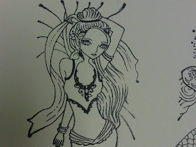


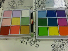
Get your chalks out and ready to go.


Option one for colouring is to use little eye shadow daubers.
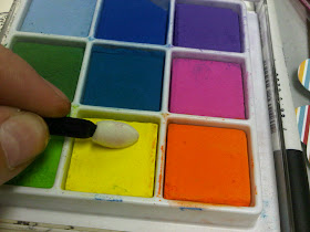


Option 2 is to use a cotton swab. I always remove some of the extra cotton so that I have more control with the colour. I give a little tug, then cut off the excess. When you have picked up the chalk on your dauber of choice, give it a little blow just like you would do with eyeshadow before you apply it. This just gets rid of some of the extra little dust that comes up and will prevent it from falling where you don't want on your image.
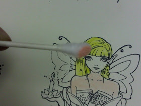
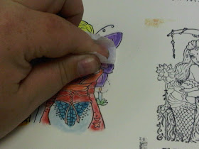


Again I always start with the lightest colour and work my way to darkest. I don't usually worry much about shading when working with chalks because it doesn't really show up. I like to use a light pressured, circular motion. Keep in mind you can always add more colour but taking away is harder. You will have to blow excess dust off your project every so often, welcome to the world of chalk.


Move on to your next colour, this time I am using the cotton swab. Don't try to put more than one colour per dauber or clean off the eye shadow ones, it just results in a mess.


Once you have coloured your image completely it will look something like this.


To set the chalk you will need to burnish the image. For demonstration only, I used a muffin paper. Don't do it this way. Put a piece of scrap paper down overtop of your image and use a bone folder or your finger to burnish it.


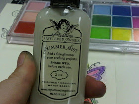
Now you can stop there, your image will hold up just fine. Personally, being a glitter nut I like to spray a little glimmer mist overtop. This is diamond glaze, and just adds a touch of glimmer, it isn't overwhelming or easy to capture using a picture.


This is my totally finished image. There is a little chalk outside the lines from my muffin paper burnishing. If you use the paper method you won't have this.


I hope that you enjoyed this tutorial. Don't be afraid to get out those chalks, they are inexpensive and easy to use.


Tomorrow I am going to be posting some of my submissions for design team calls... we will see how it goes.

Thursday, August 18, 2011

You don't have to have Copics...

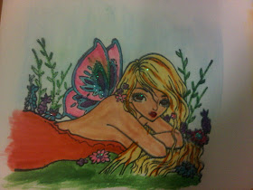
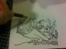
Let's try this again, since last time all my words started disappearing as I moved the pictures around to their proper position. So today I got these amazing stamps in from Sweat Pea Stamps
and I just had to get them inked up and start creating. Now as you know I am on a pretty tight budget so Copics just aren't an option for me, they are just too expensive. I have several techniques that I use that will still give you the depth, blending and shading that is such a popular draw in the copics. Option one is watercolour pencils and then blending them out using either a blending pen or a water brush (or a paint brush dipped in water). This technique takes some practice so you don't completely sog your paper while you blend, and your need to colour smoothly with the pencils or you may get an uneven look (as I did with the background in the picture below. I should have done the background first, not as an afterthought).
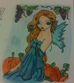


Option two, which is what I am going to show you today is how the rest of the picture was coloured is done using your inkpads (and I know you have them, don't lie!) and a blender pen. Let's check it out.

Supplies


  • A stamp with some actual spaces for colouring

  • Stazon ink

  • Water based inkpads such as Close to my Heart or Ranger's distress inks

  • Blender pen (available at your local scrap store, usually double ended and not refillable)

  • Heavy white or offwhite cardstock


  1. Stamp your image using Stazon. This will keep the outline from bleeding while we play.


2. Shade your background colour with a coloured pencil or the blender pen and shade it out how you like. Remember it is better to start light and build. You can always add, taking away is much more challenging.


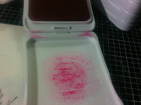
3. Next, how do we get the ink from the pad onto the blender pen? There are 2 methods and it depends on the shape of the ink pad you are using. I personally just squat the lid of mine into the top of the ink and scoop it up from there. Option 2 is a non-stick craft mat or a piece of wax paper. Stamp the whole pad down on it and pick up the ink from there
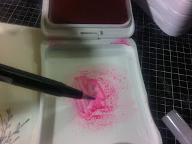


4. Now we are ready to start the fun part. I tend to start with larger areas first, but the more common (and one I will recommend) is to start with your lightest colour and work to your darkest. There are things like red lips that you absolutely can't do before you do the face, so make sure that you plan your mode of attack.
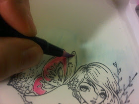

Ok now imagine this first. You have essentially loaded a paintbrush; wherever that lands will be the heaviest amounts of paint. It is the same with this technique. For the most natural looking art, I always imagine that the sun is beaming down from the left side of my workspace, making the most pronounced shadows on the left side of the image. So sweep your way from left to right (gently until you get the feel) and sweep by sweep, build up the colour until you are happy with it. Then move on to the next one.


It is VERY important that you clean the ink off your blender pen thouroghly between colours. The easiest way to do this is with a piece of paper towel or tissue and absorb it out.


Once you have all your colouring done, you can throw on some extra highlights in the hair, or on dress folds. This is the time to add things like sparkle highlights as well, but they don't show well on these pictures.


Ok, now it is your turn. Show me what you can do without using copics. Who knows, there may even be a prize in it for you.....

Wednesday, August 17, 2011

Ok Ladies and Gents,


Sad news... my scanner will only work for cards, not 12 by 12 layouts. This means that you get a crappy blackberry picture again today. I will find my camera cord tomorrow, I promise!


So here is today's page for you. It is using a mix of K and Co. sparkley paper and ribbonthat I have only been hoarding away for 7 years. Gotta stop doing that, just use it and then I can get new expensive paper right? So the rest of the paper is Close to my Heart, the lettering is done using some Stickles (I think it is called Patina), and then I threw on some huge Heidi Swapp flowers with some unknown brand on top. There is a border under the pictures on the right which is from CTMH.


This layout features my beautiful baby girl second cousin's once removed; the next generation of our very close Coffin Clan. There are 3 beautiful girls shown here, and then 2 gentleman who were a little jealous of the attention the girls were getting. I don't know how well you can see it, but my fav picture is the first one on the right page; the little girl on the left (Leila) is trying to push over her cousin (Mya) who is holding on to the grass for dear life.


Again, sorry for the weird picture and the funny overlap. I will get better pics going as soon as possible.


Monday, August 15, 2011

Superfun with Glitter

Good evening ladies and gents. Tonight for your viewing pleasure I have what may be my favorite page I have done ever. I will state straight up that this is a scraplift from the ladies at Carosel Rubber stamps.


Ok so for the items used


  • 115 mm and 2mm sookwang doublesided tape


  • several colours glitter ritz


  • mask shapes (plastic is the easiest to get off, but paper works too)


  • 1 piece of cardstock


  • mini muffin papers (I will explain later)


  • large craft mat or scrap piece of paper (has to be bigger than the paper you are working on)


  • paint brush or papertowel


  • An apron or garbage bag to cover yourself in....


Ok so here we go. First make sure that you have some clean space to work in because the tape is SUPER sticky. If you have one of those anti-static bags for embossing, rub down your cardstock and your craft mat, it will make things easier in the long run. Glitter ritz has a static charge to it, so it likes to stick.


  1. Put your tape as you would like it on your page. I won't judge you at all if you would like to cover your entire page, I know how awesome this looks! Remove backing and place masks how you would like them. Ensure that they are stuck down well, or glitter will sneak underneath and your design won't look as crisp


  2. Pour your first colour of Glitter ritz into the muffin papers. I find this is the easiest way to contain them, but you could also use a spoon or a straw. Gently cover the areas you would like in this colour. Gently use your finger to burnish (rub) the glitter into the area. This just ensures that you get a really rich covering and that other colours won't stick in the spaces


  3. This is the hardest part right now. You can't just tip to the side like you would with embossing powder or you will end up with a line of glitter. You must flip the page over completely in one swift motion, and then tap your layout. This will put all the excess onto your craft mat, then you can put as much as you can back in the jar. Make sure that your mat is completely clean before moving on to the next colour, so use the paintbrust or the paper towel to wipe it off. If you are using one, give it a static sweep too.


  4. Repeat with all of the colours until the tape is filled.


  5. To finish off your creation, use the 2mm tape to create a nice clean border. Lift up your masks, then use black (or your colour of choice) to fill in the borders.


  6. To ensure that the glitter doesn't invade your house, do another round of burnishing. The muffin cups and your fingers work well for this but you can also use a brayer.


  7. Add in your pictures, and if you get excited a few accents. I used a Close to my Heart crocheted flower, a pewter brad and a Prima flower that matched my glitter colours. To add some dimention I also added some butterflies the same as what I had used for masks, but only attached them in the center. Remember you need heavy duty adhesive like liquid glass when attaching to glitter


Have fun!! Love to see what you would do with this technique.


In other news, I promise better pictures from now on. I think that the scanner is going to work out.

Sunday, August 14, 2011

Wow. I REALLY Dropped the ball this time!
Ok I have been very lapse on posting, but I have tons of projects and ideas to share so lets get back at er.


Let's start with a quick update: business has improved slightly, I am no longer having stabbing belly pains but the doctors don't actually know why other than the low dose pain pills daily, still on leave from school but I am heading back to conquor the nerds in a few weeks. Close to my Heart has a new catologue out, our new paper is heavier and gorgeous and we have lots of great new accessories so you should totally check them out.


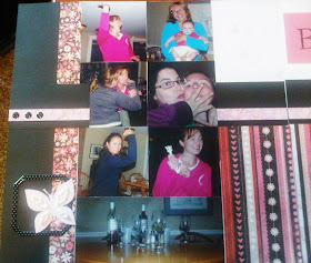
Moving right along; I am going to show you a workshop on the go layout that I did the other day using our "Sweetheart" set. It has liquid applique on it for a little bit of dimension, some epoxy accents and a whole slew of pictures. I did change around the colour scheme a little bit, I thought that there were too many hearts and my cotton candy stamp pad was mia so I used baby pink.


Hope you like the layout and we will see you tomorrow with another!